 And then here I am, to tell you something about this year's Sitges exhibition. It may be objected to me that more than a month has already passed, però, sapete com’è, I like to take it easy, and the management of this blog non fa eccezione. After all, I am sure that many images of the works exhibited in Sitges have already been posted on Facebook, some with exhibitions still in progress, so a few more weeks makes no difference.
At this point one might wonder what this could be for post, e, I will tell you, I have doubts too, but when I happen to review some photographs that we have taken, the temptation to describe arises irresistibly, to comment, conjecture, deciphering what a distracted glance might miss. You do it for the benefit of those who, for various reasons, they were not present, it is done to offer an original interpretation (and hopefully authentic) of what there was to see, it is done to give a further reason for satisfaction to those who have created those works, this is done to encourage a "person" visit to future editions of the exhibition, and finally it is also done for personal pleasure, almost as if composing this post was also making a patchwork, not cloth, questo è ovvio, but by stitching together images and words.
I'd say start with a confession, i.e. that Sitges was sort of MacGuffin for an excursion to the Iberian peninsula that had already been planned in 2020, but which the pandemic caused by the Chinese virus had prevented us from doing. Quindi, after dedicating an entire day to the exhibition, we extended our stay to also enjoy the beauty of that suggestive corner of Catalonia, and then off again to Barcelona, to Granada, in Málaga, a Madrid e a Toledo; let's say it's been two "intense" weeks.
It was an experience that I will not soon forget, we have seen and tried very different things, amazing, and met people whose affability has always pleasantly impressed us.
It is true that, when travelling, some inconvenience can always happen, especially when you do it yourself, but if of my journey with Filixbus up to Barcelona I can't say anything but good (17 hours flew by as if nothing had happened), I can't do the same for Renfe, the Spanish railway company, which has more often shown unacceptable deficiencies, both on local trains and on the so-called “Alta Velocidad”; of the road (via ferrata) they still have to do to reach the European standard.
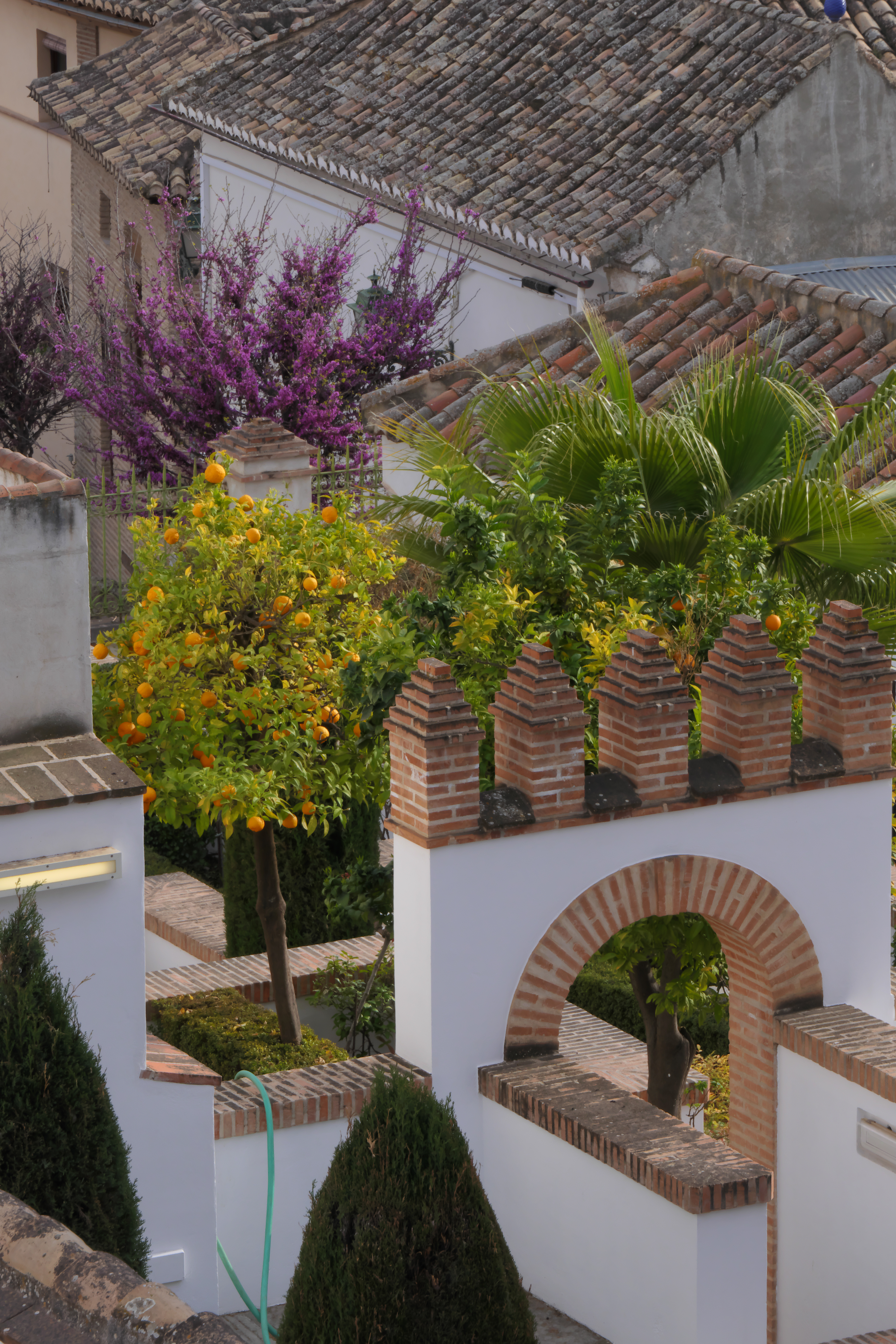
Of everything I saw in those two weeks, tried, eat, bevuto, heard, bought and enjoyed, the thing that surprised me the most were the oranges from Granada. Lo so, it seems trivial, after all, the oranges are here too, and the Sicilian ones are also excellent, però, try to imagine some orange groves in the city, in the center I mean, with their beautiful fruits on, and maybe in the distance you can see the snow-capped peaks of the Sierra Nevada. Ask about it, we have been told that it is a quality of relatively not very juicy bitter oranges, of which only the peel is used to make, mainly in the UK, a very tasty marmalade. Essentially, except in crops outside the city, orange is considered simply a beautiful decorative plant.
Comunque, se vi va, nel blog ultimelune.it you will find the photographs that my sherpa / tourist guide / webmaster / ecc. he snapped during our trip.
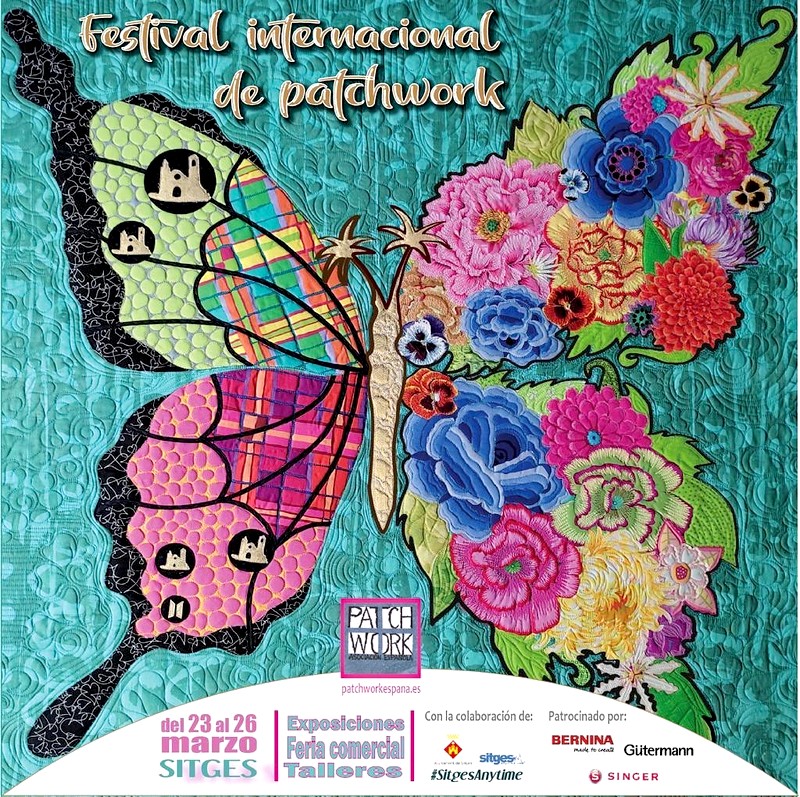
Bene, it would be time for me to tell you something about the exhibitions in Sitges and for the right momentum I would go back to the last words we wrote in 2015 (a lifetime ago…) in the post HELLO!
Sitges, un piccolo paese per una grande mostra.
Da rivedere.
Da rivivere.
Con chi ci sta.
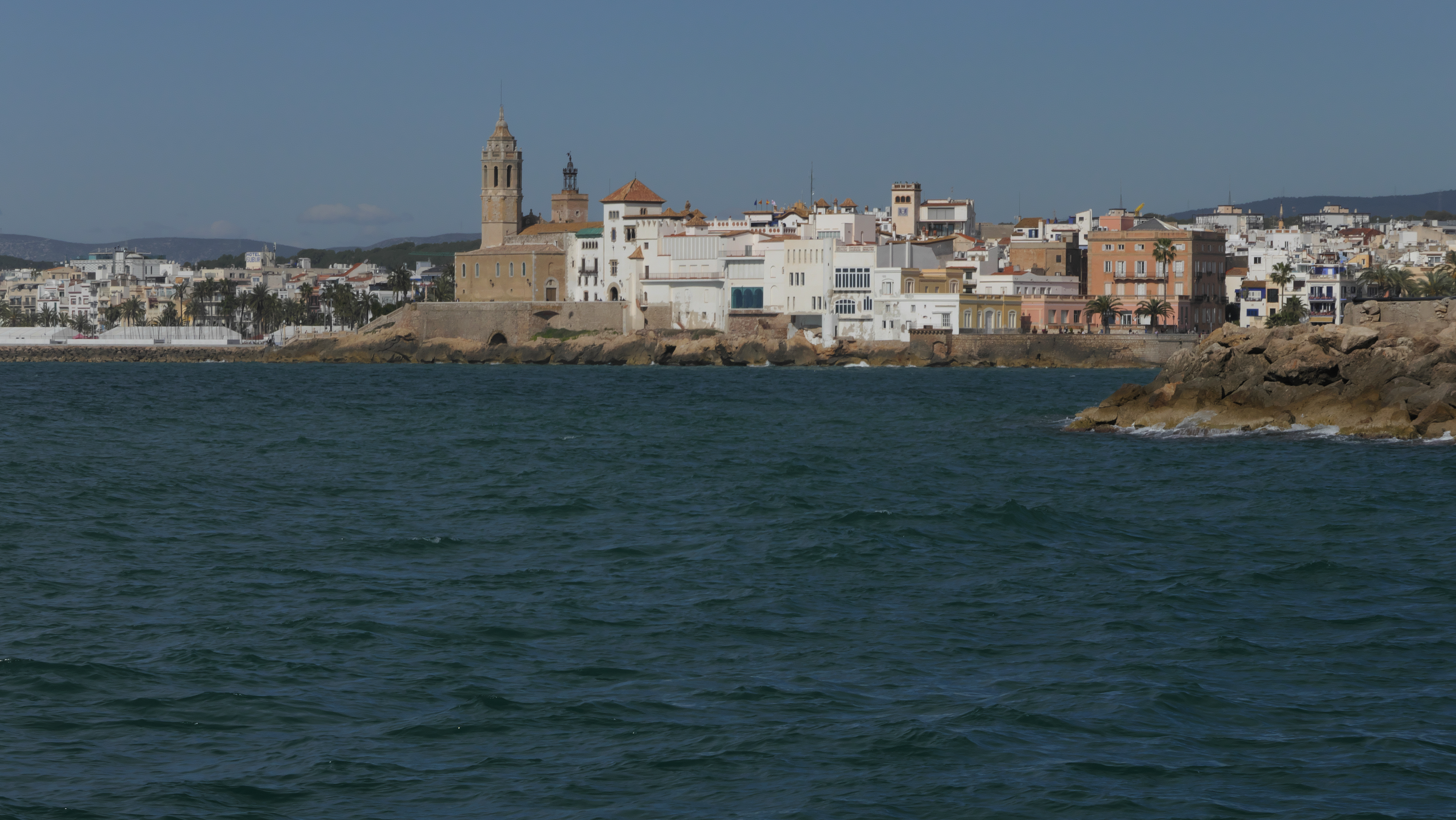
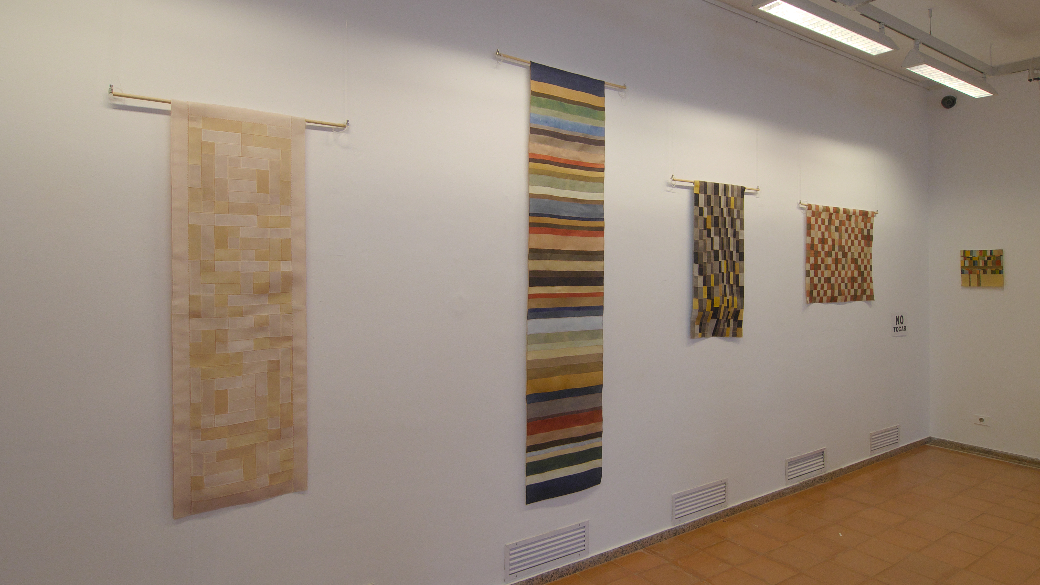
Bene, obtained, not without some logistical difficulty, bracelets for entry to exhibitions, we went in search of their location. Maybe this one of ours “random” proceeding may seem inefficient during a visit, however, this is the direct consequence of some organizational shortcomings. The next days, other locations and other experiences, they confirmed my belief in the existence of a vague carelessness, or a general uncertainty in the information. To put it mildly: they get lost in a glass of water.
Already finding the ticket office was not easy, lacking sufficient indications along the streets of the town, but the beauty had to come when, to get the exhibition map, it was necessary to interface with a QRCode, which then referred to a site web dove, with precision unworthy even of a playful treasure hunt, it was intended to guide the female visitors to their destinations.
Well, si sa, or you should know, that the average age of fans of patchwork it is not that of high school students, therefore their confidence with the most modern means of communication is not guaranteed. Il QRCode it will do well in a pizzeria, but it is said that it should be considered the optimal interface for those with the smartphone has an often adversarial relationship. When then in the use of internet the amusing chats on Whatsapp prevail, it is hard to imagine that people could go to download and consult maps in PDF format without a fight, and got those too, it would be a question of consulting them on the tiny screen of a mobile phone, and not all people of a certain age necessarily enjoy a view worthy of a peregrine falcon.
Insomma, we don't know how and we don't know where, at the exit of the first exhibition, a precious paper map jumped out which we immediately appropriated.
Mah…
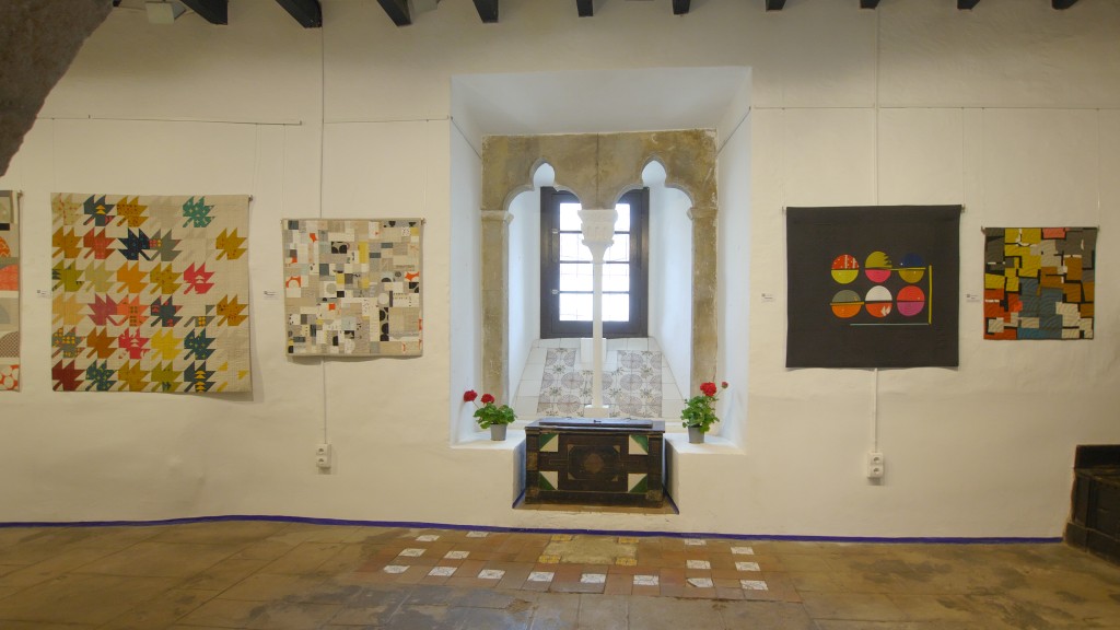
At least in the beginning we went a little’ memory, thus arriving in the room where the works of Sarah Hibbert were exhibited, and as they say, who starts well…
 In addition to the particular skills in the use of color and volumes, I liked her ability not to repeat herself, to range from the more traditional forms, the maple leaves, to the most improbable objects, come i macaron.
You say you get carried away by improvisation, as if it were a particular geometric motif or a certain chromatic tone that dictated the composition, step by step. If she were a musician the jazz that would be his genre, where you improvise a lot, ma, paying attention, a complex structure always emerges which reveals the particular skills of the soloists.

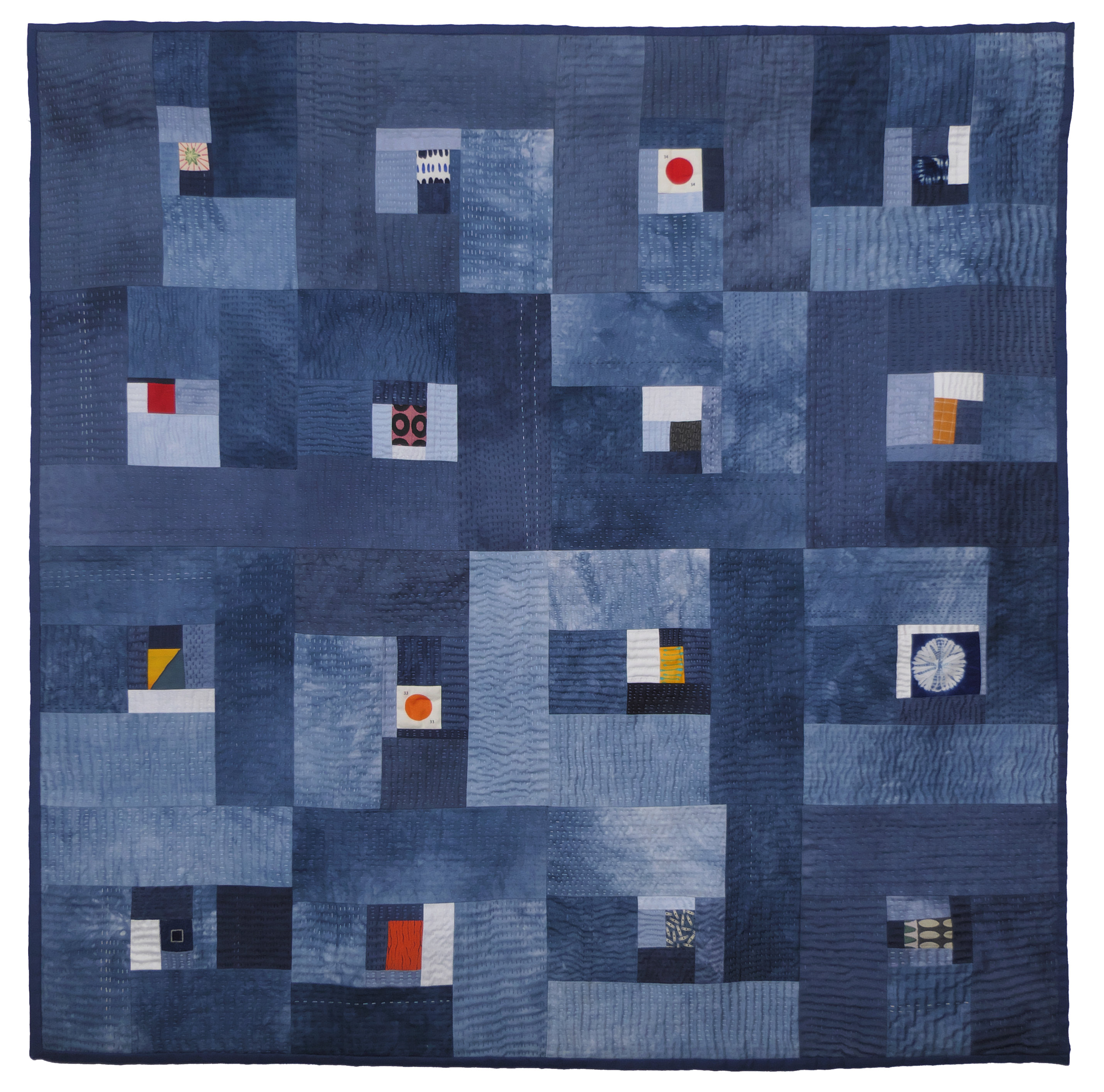
Sarah Hibbert – Wild Blue
Among all the interesting works of this quilter, I wanted to offer this, not because it is the most captivating, the most conspicuous, but precisely because the choice of blue color is particularly “understatement”, that is, only by observing it carefully can its qualities be appreciated.
I suppose you wanted to represent various aspects of the sea, the wild blue that presents a different shade every day: “La mer, the sea, always started again!” (The marine cemetery – Paul Valery).
A patient hand quilting then gave shape to the surface, as the wind does when it raises the waves.
Haiku, chi era costui?
I confess I don't know much, Japanese poetry is not part of my background. According to Wikipedia, it is a poem born in Japan in the seventeenth century. It is composed of three verses for a total of seventeen more (and not syllables, as commonly said), according to the scheme 5/7/5.
Bene, now I know almost as much as before.
But Sarah Hibbert has certainly managed to capture its essence and aesthetic beauty, finding in the chromatic composition a visible form to this poetic form.
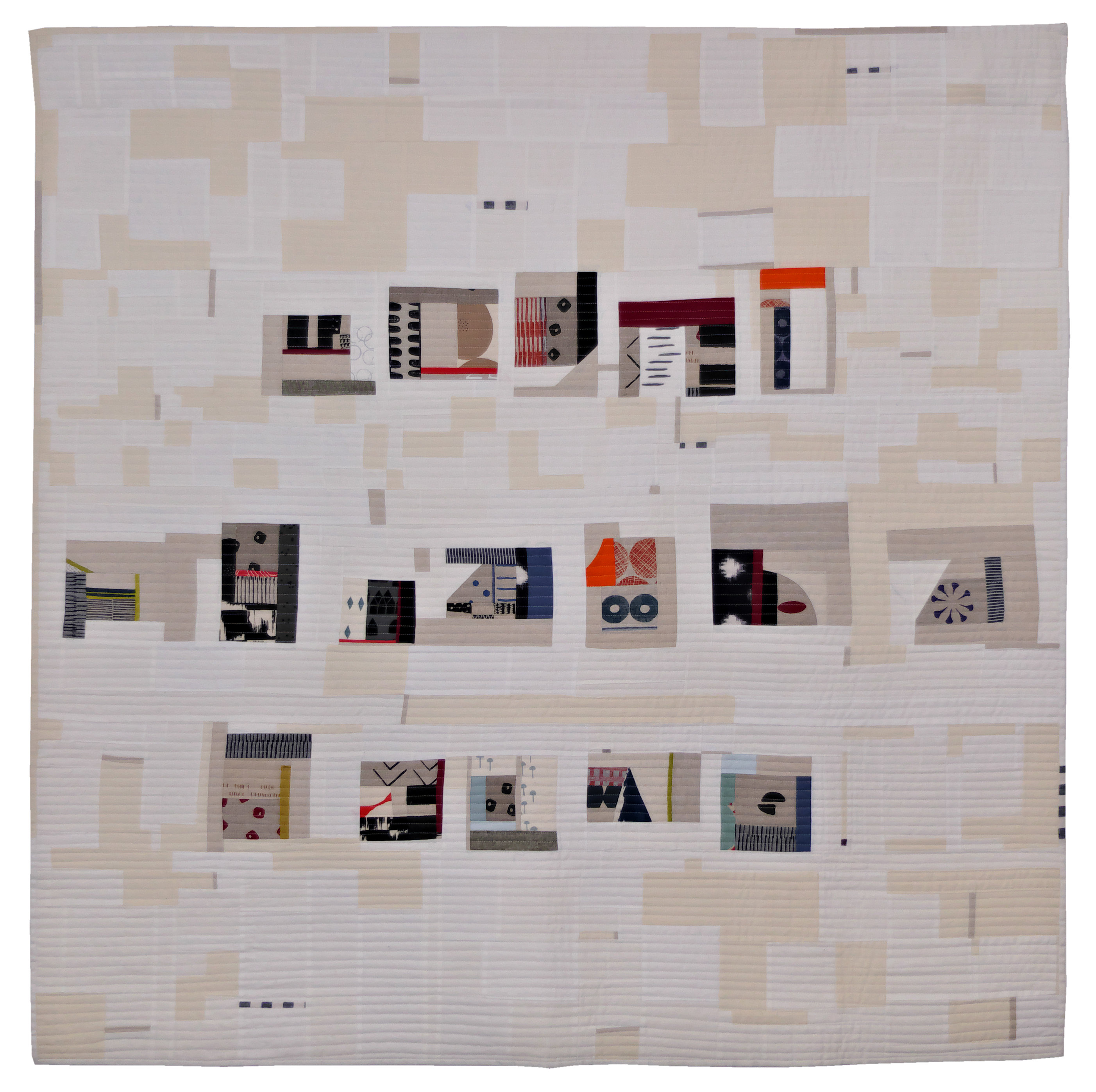
Sarah Hibbert – Haiku
Sarah Hibbert happened to hear an interview with John Cooper Clarke on the radio, an English poet, which he explained, evidently in a very interesting and understandable way, the harmony of the compositions Haiku.
I assume you wanted to investigate, e, including the difficulty of composing one with words, has chosen a textile composition that recalls its structure, always improvising, ça va sans dire. He used small blocks of different shapes and colors to simulate the “more“, and a background that was supposed to represent a sheet of paper Shiramine, with a purple dot at the end of the composition, as if to remind the observer that it is always a written composition, but with letters dictated by his unconscious imagination.
Only an arm of the sea separates the Japanese islands from the Korean peninsula, and precisely in South Korea we are now going to discover works that decline al patchwork today an ancient tradition.
Since 1400 it was used to wrap a gift or a precious object with pieces of fabric called duty, generally made of silk, although it was possible that some vegetable fibers were used. The origins of these packaging fabrics go even further back in time, until the mythical era of the Three Kingdoms, but the transience of the materials used decreed the disappearance of those artifacts.
Finished the creation of duty it could happen, proprio come oggi, that they had scraps of fabric left over, and with those the women made a patchwork named rights.
Dukjoo Choi has continued that tradition, proposing very delicate works in the structure (a single layer of silk or ramie) and in the choice of colors.
Dukjoo Choi – Rights
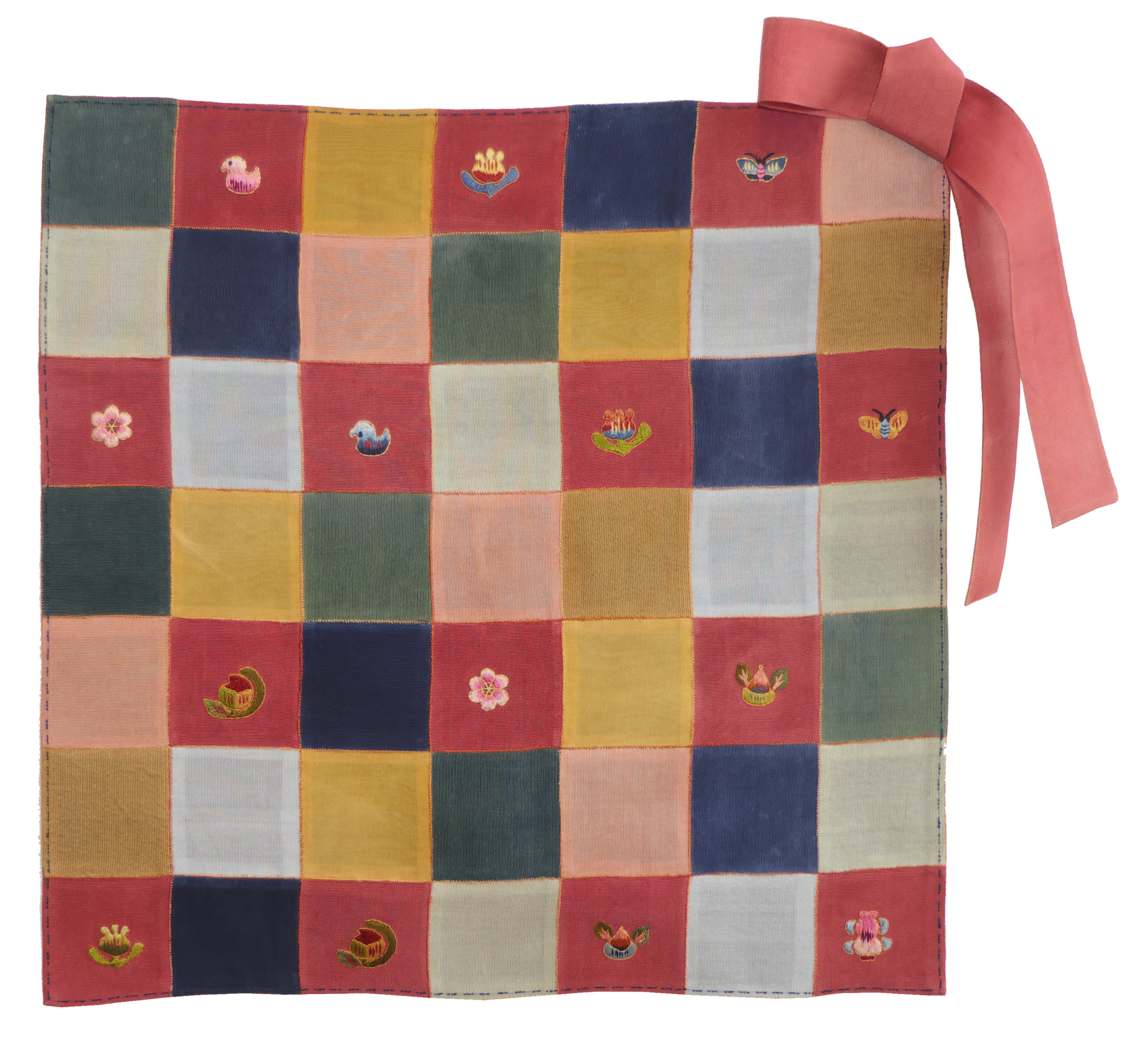
Dukjoo Choi – Small jogakbo

Dukjoo Choi – Small jogakbo – Detail
A particular preciousness of these works lies precisely in the colors, having been used natural products to dye the fabric, as for example with mugwort for green, the gardenia for the yellow, and it Jjok for blue.
All this offers the sensation of an object that in its utmost simplicity reveals care, the patience, the serenity typical of a culture that we sometimes fail to understand due to our crude yardstick, and I could even imagine making one gamebko and how to follow a beneficial spiritual path.
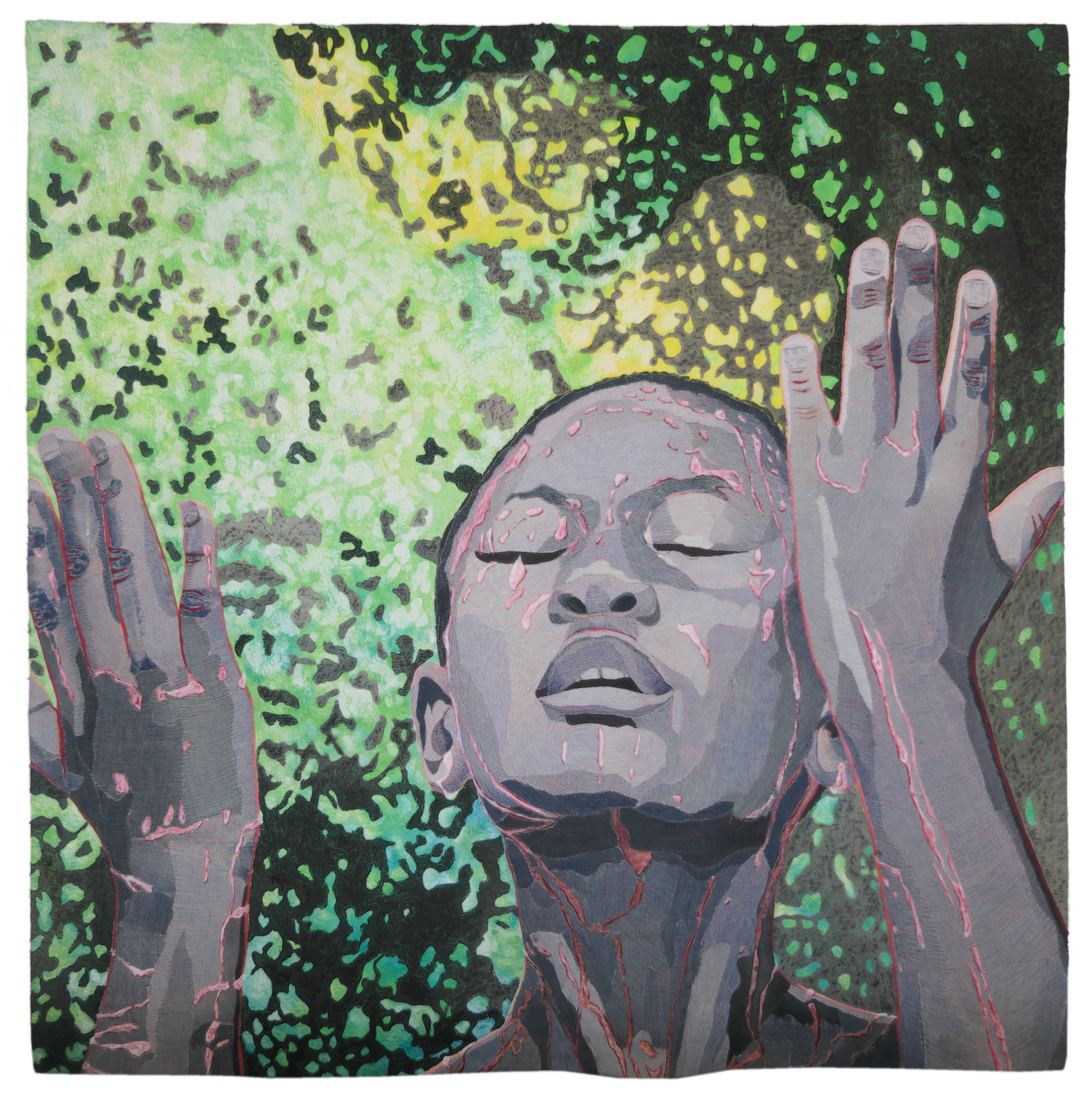
Hollis Chatelain has lived for more than a decade in West Africa, collaborating with some humanitarian organizations, coming into direct contact with the local population, and above all sensing their problematic situation. His works represent the beautiful and the scary of that land, and the colors of nature and the shadows of an unpromising future.
I don't know if in his case we can speak of patchwork real, I'd rather call them quilt paintings, doubly valuable as they denote a very happy figurative hand and a quilting technique that enhances the image even more.
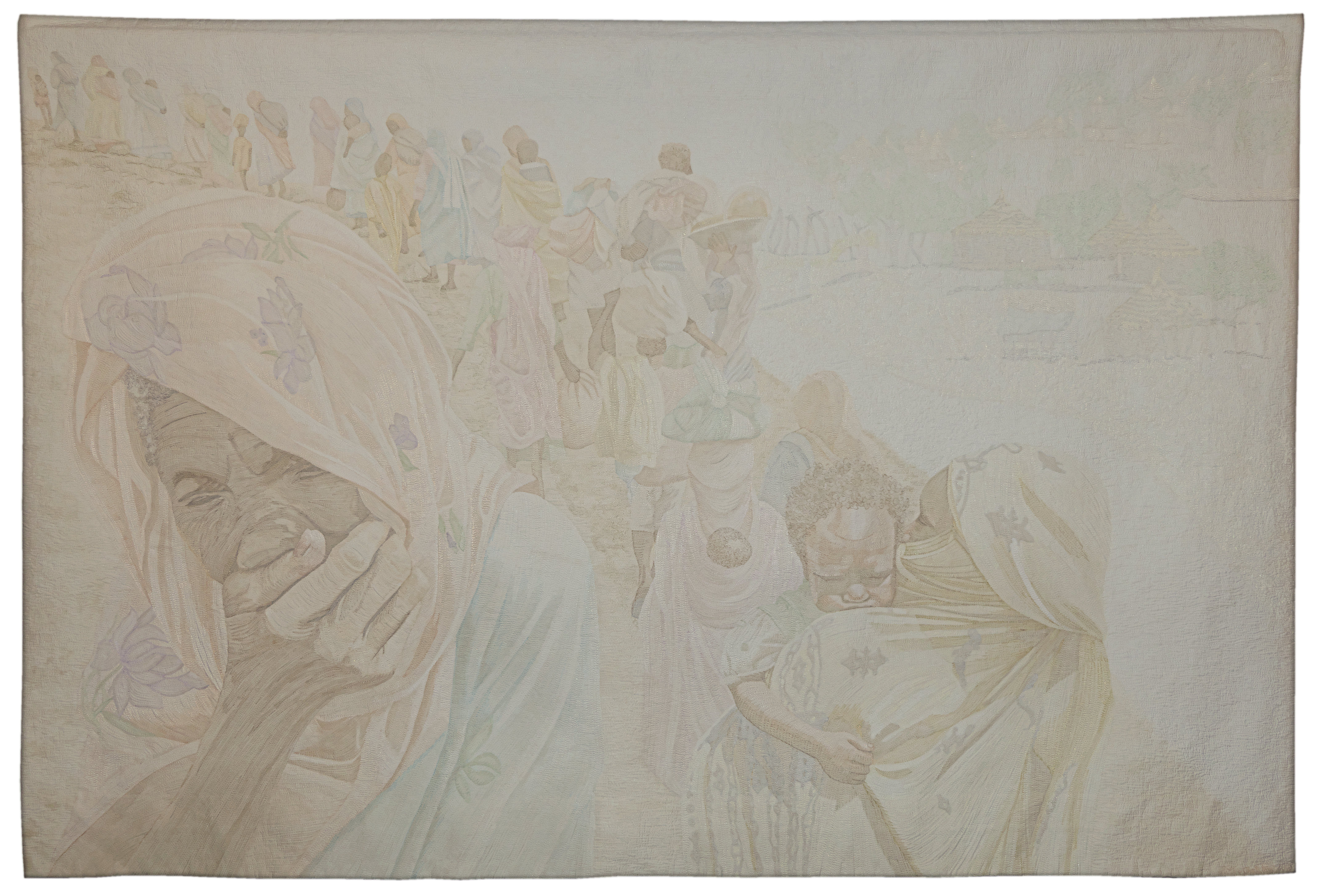
Hollis Chatelain – Exodus
Hollis Chatelain – Exodus – Detail
The work you see above, as the title already explains, represents an exodus, and in this case it is the flight of refugees from Western Sudan.
In a province already plagued by poverty and drought, nel 2003 the Sudanese government set up a civil war, and blatantly supported the faction that oppressed the non-Arab part of the country. That war was a kind of genocide, to escape which he had to undergo a forced migration, an exodus that, due to the extreme scarcity of resources of the population, resulted in hundreds of thousands of victims of starvation and disease.
Hollis Chatelain does not bring us a journalistic image, one of the many that occasionally clog, unfortunately I have to say almost to no avail, our news bulletins, instead she intended to transpose on fabric a dream that one night she happened to have, indeed I would say more of a nightmare in this case, and given that the dream image was monochromatic, he wanted to respect that memory also in its representation. The result is gone, secondo me, far beyond its intentions, obtaining the effect of a row of refugees whipped by a sandstorm, or characters made almost diaphanous as fleeting from our memory committed to remembering only negligible offenses or small gratifying things.
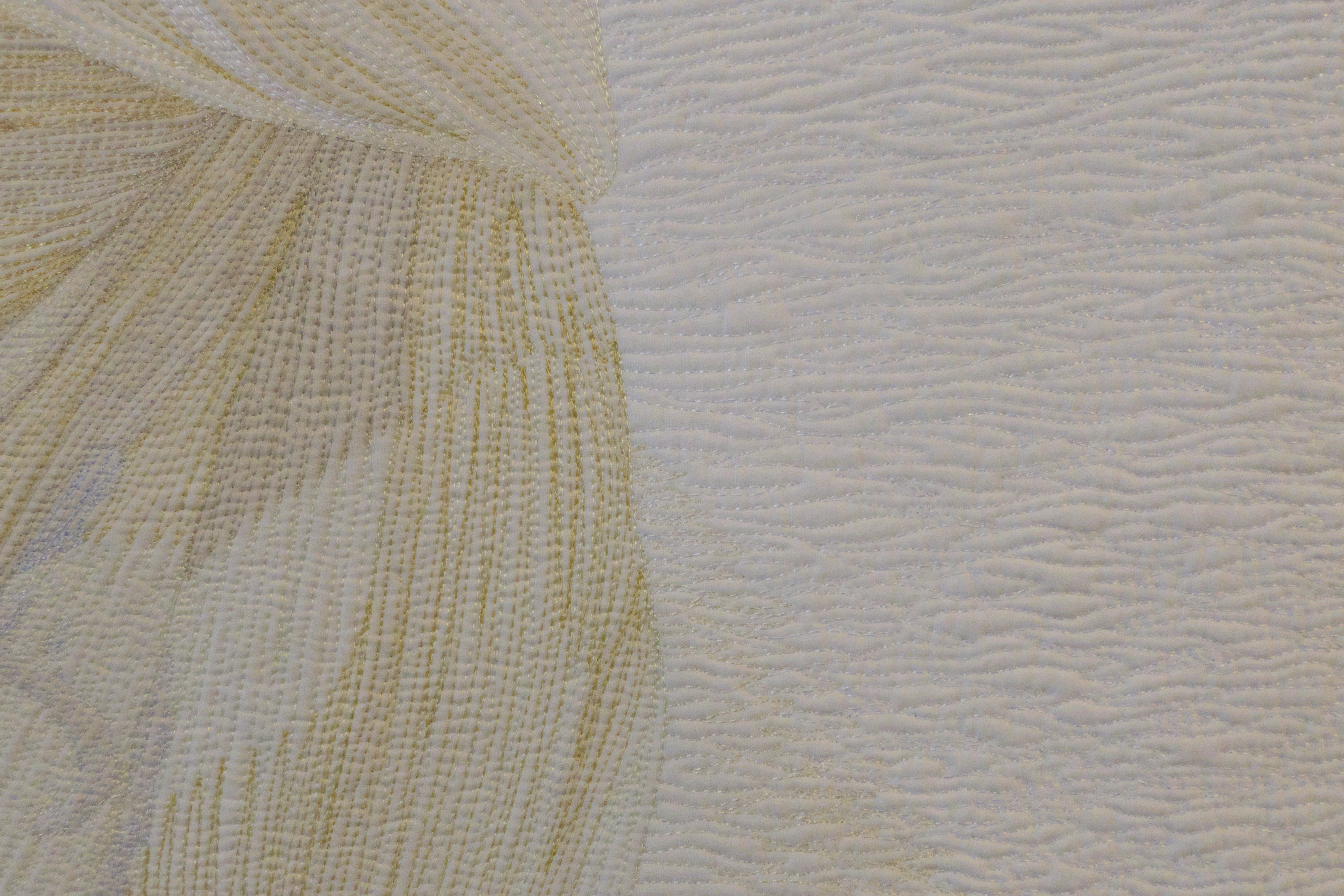
More similar in technique to the patchwork that the painting is the work “Source of Life”. It is a fabric dyed by the author on which a layer has been applied denim for the face and hands.
Hollis Chatelain – Source of Life
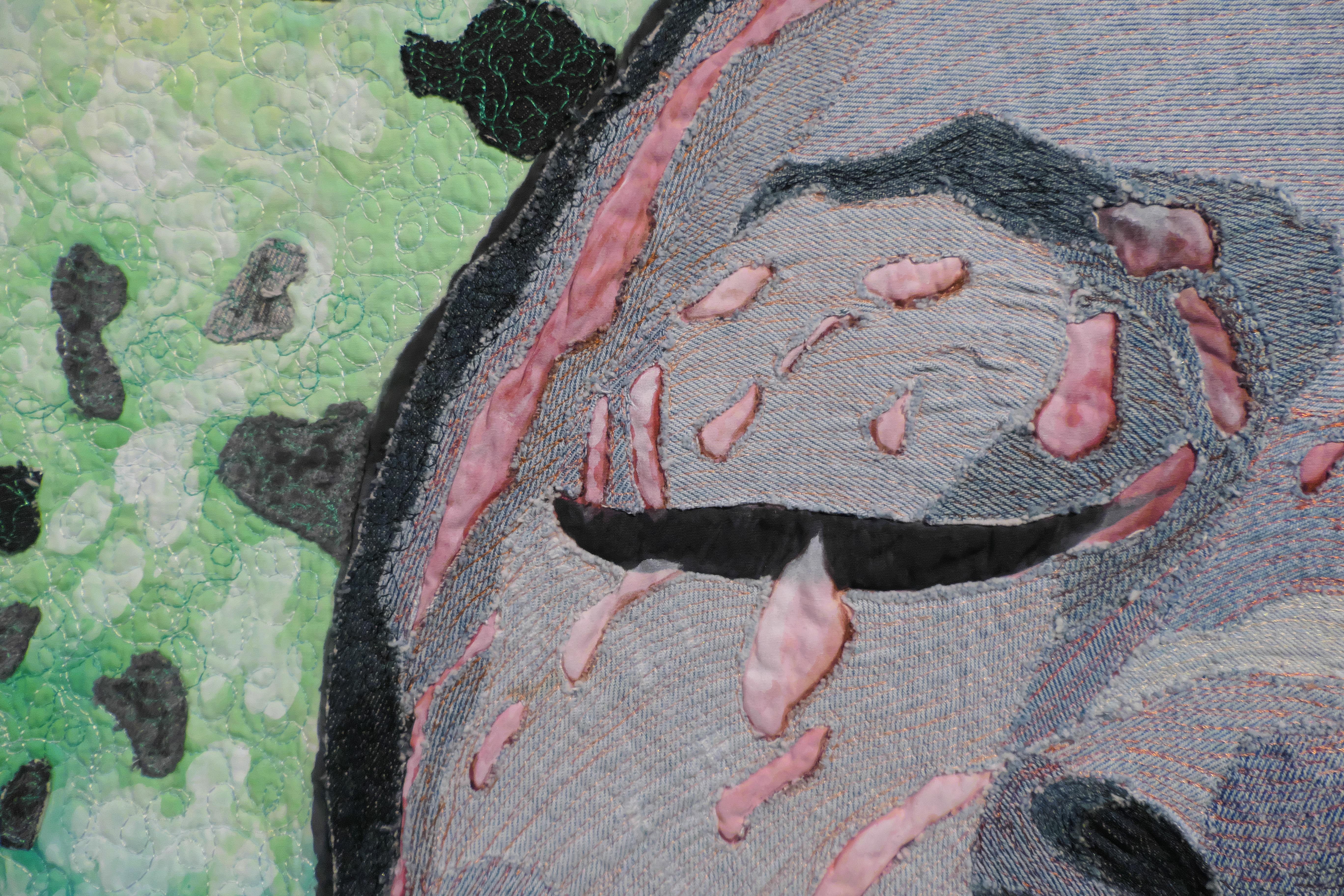
Hollis Chatelain – Source of Life – Detail
Too often we forget how precious water is, we shouldn't wait for summer, when they issue alarming drought bulletins, to do an honest self-examination of our bad habits. We waste it here, we dirty it, we ignore it, but she knows how to take her revenge, when it makes you want up dry rivers, campaign, taps, or he turns against us, escapes from the prisons we have erected, it disrupts over-tamed territories, overflows, overwhelms, kills.
Instead, water is essential, without it, life as we know it would never have appeared on our planet, without it all that is alive would disappear, us first, therefore water is the source, the womb, Mother, the cradle of life.
I liked the idea of giving a pink tint to the water, perché, I imagine, if blood is the life of our body, water is the life of our planet (including us), and therefore those two indispensable fluids, one red and one transparent, they have united for a common purpose.
What “I like it a lot” of this event, in addition of course to the pleasantness of the place, is the possibility to admire the works created by quilter which I've never heard of, but what, even within their limits, they demonstrate taste and originality. For me it's a bit’ like going back in time, when I was excited about everything, and all of the patchwork it amazed me, it fascinated me, it captured me.

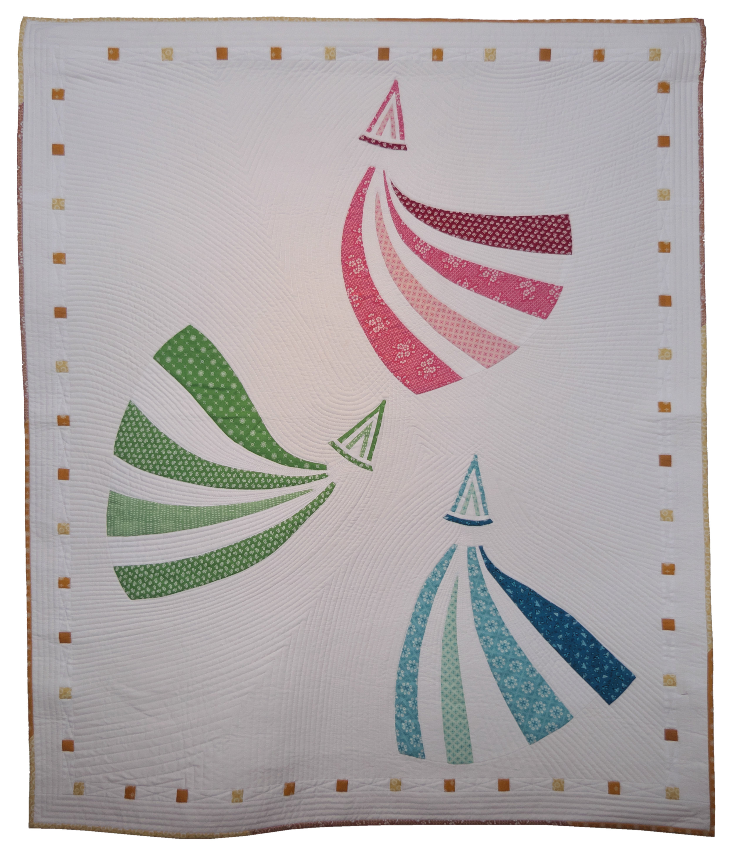
Contxi Caballé – Fly making color
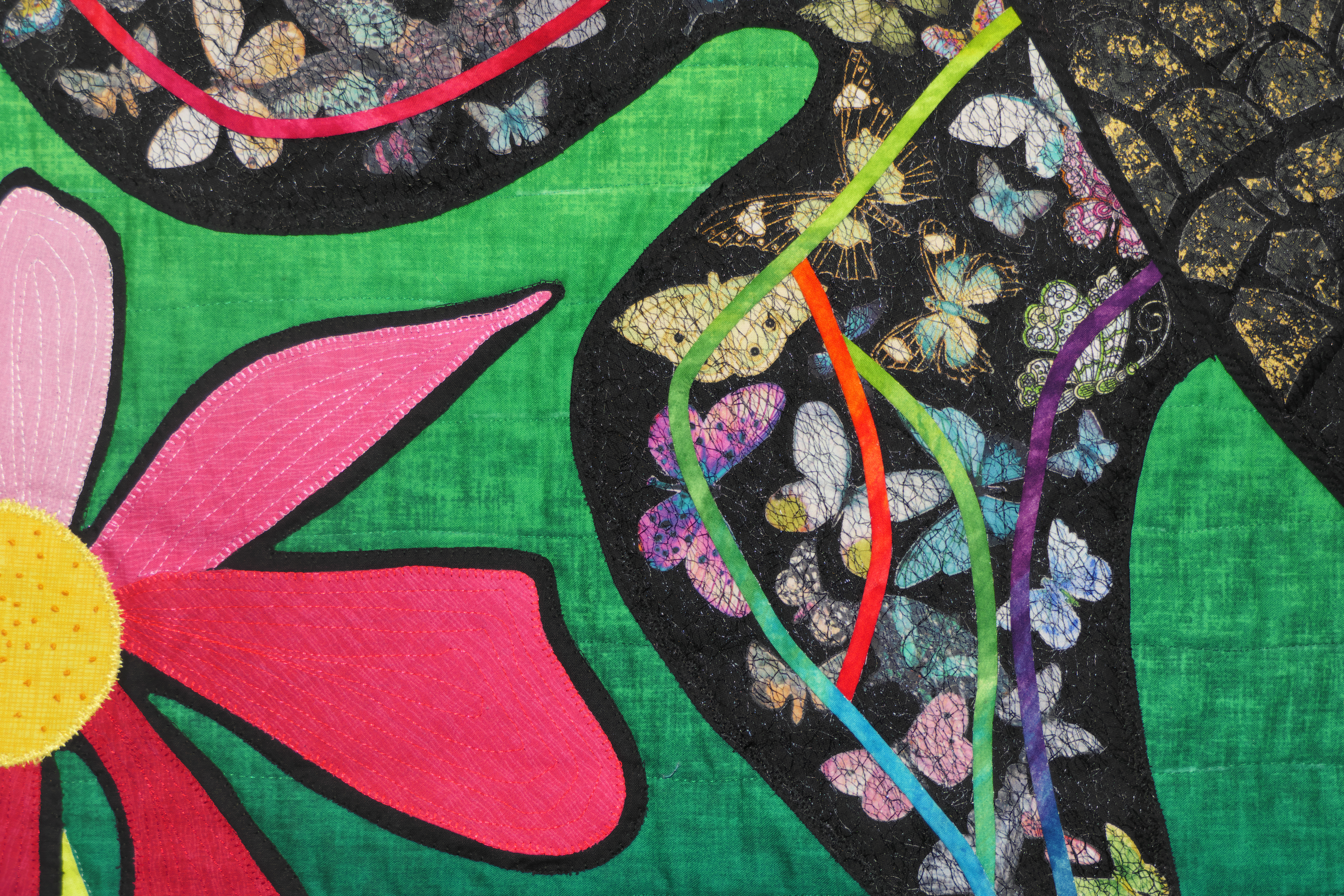
Contxi Caballé – Fly making color – Detail
This butterfly butterfly is a fun idea, both for the viewer and, I'm sure, also for Contxi Caballé who assembled it. Nothing brainy, of complicated, of contrived, only the desire to match the lightness and the iridescent nuances of a butterfly's wings.
Complimenti.
Read the title of this work, Ângels López is definitely Catalan. Of course she has it easy, there the climate is more than clement, there are spaces and perspectives that are rare here, the colors are brighter, and the contrasts between sea and land, between light and dark, between green and stone, they are exalted by a light that seems to never end.
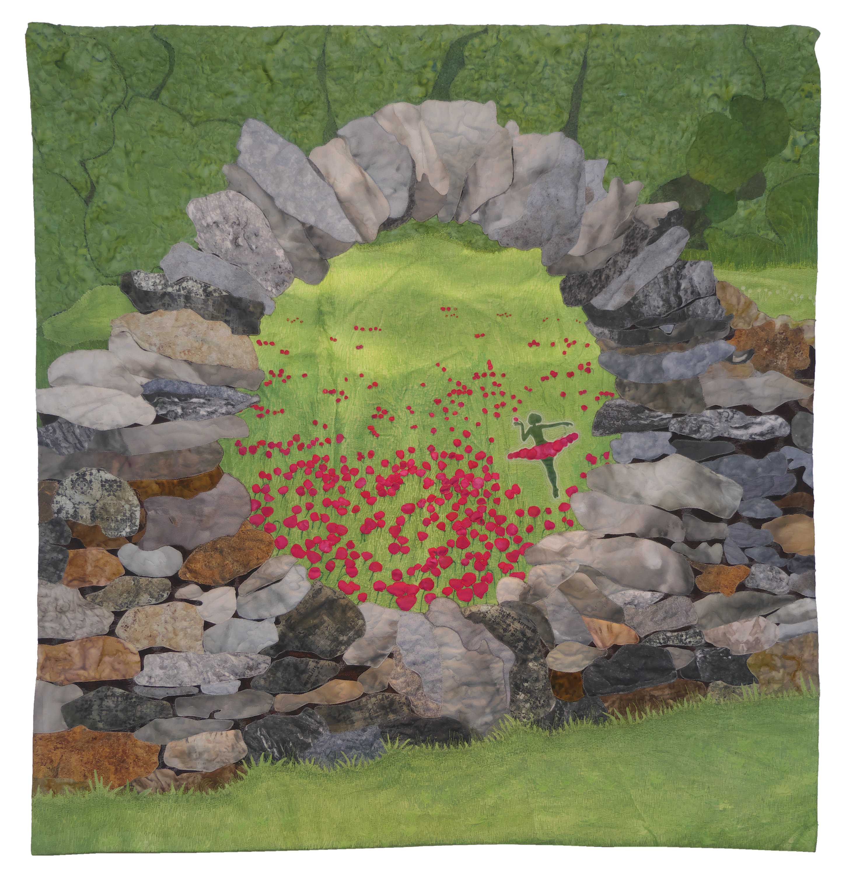
Angels Lopez – Spring burst
I don't know where you found this “eye” rock that embraces the explosion of spring, nor have I any idea how she got the happy inspiration to transform poppies into a ballerina dancing on the lawn. Still, it's a doubly great idea, first because it suggests a movement which is then that of awakening nature, and second because it transforms a “simple” meadow in one place “magical”.
Look at the work below, and tell me if it doesn't look like an oil painting on canvas.
If Angélica Miras wasn't a very good one quilter she would probably be a painter, or a sculptor, a musician, a poet, anything, because when such a result is achieved, the artistic flair of the person is evident. She has created her own very particular style that she likes to define “painterly realistic“, and indeed by us it would be classified as “material”, and it's nice that one quilter introduced the fabric as new, albeit ancient, raw material, and he did it without elaborate procedures, without technical experiments, without painted additions, but only skillfully, patience and taste.
Angelica Miras – Spring in Endborgo
Just for the record: Finalborgo is located in Liguria, and has been defined as one of the most beautiful villages in Italy.
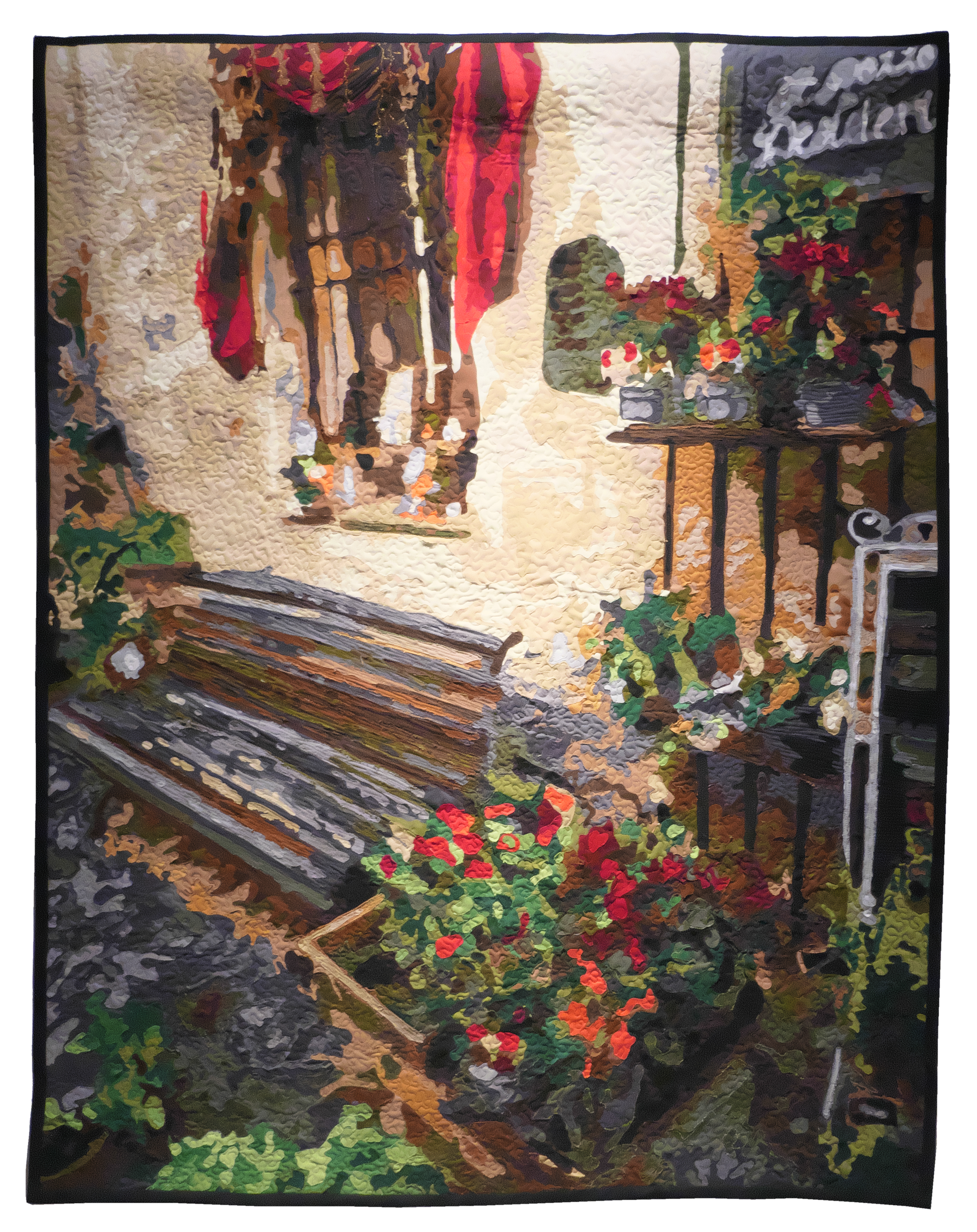
It wasn't the ancient walls, nor the rock, nor the fifteenth-century and Renaissance palaces to make the artistic spirit of Angélica Miras resonate. She fell in love with a little corner that she found wandering through the ancient alleys of the town, a corner full of life and rustic beauty.
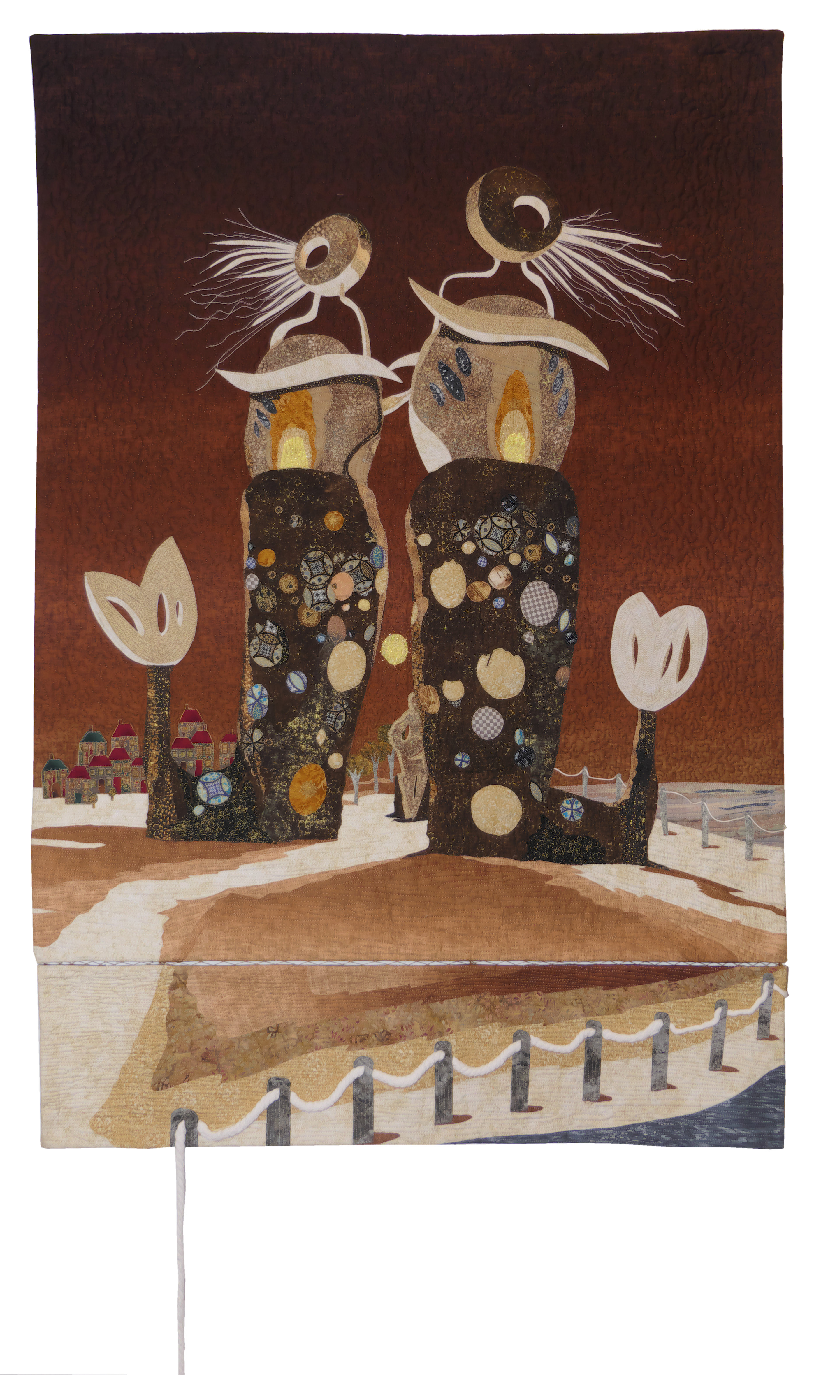
Esther Tronchoni Simo was fascinated by a metal sculpture by Toni Mari which is located on the seafront of Xàbia-Javea, a beautiful little town on the Costa Blanca where she lives (I would be a bit’ resenting…), and she really likes to go there, by bike, or walking, or stop for a drink, snack, or perhaps just to watch the fishing boats return to port. Impossible to remain indifferent in front of that work about three meters high, and just as impossible it was, per me, don't stop to admire the textile transposition made by Esther.
I don't know if the title of the quilt is identical to that of the sculpture, fact is that “A Fisheye View” it's perfect.
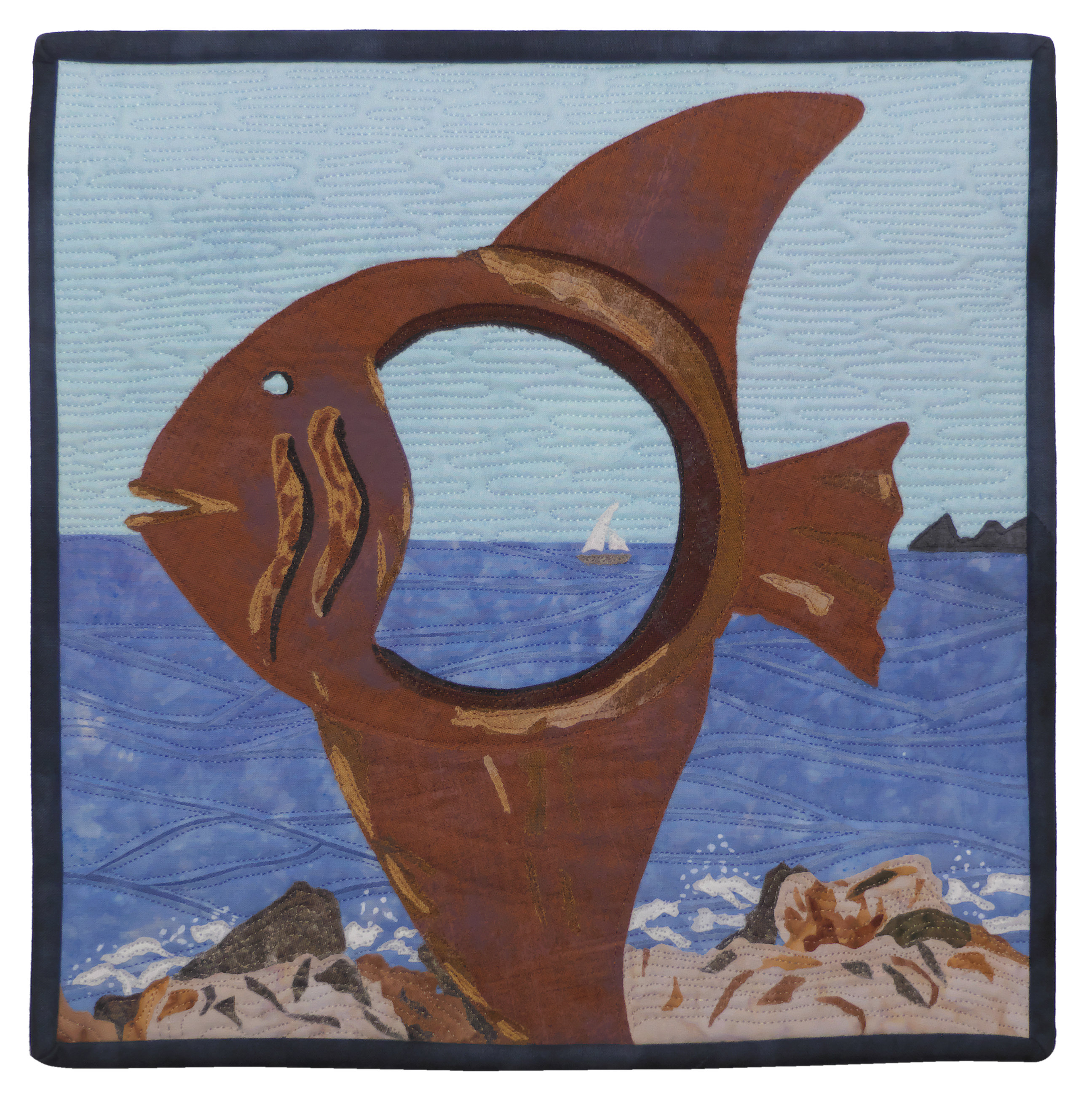
Esther Tronchoni Simo – A Fisheye View
If you stop, you will notice that your attention is drawn to what you see inside the fish, as if it were a telescope, oppure, all’opposto, a super wide angle lens, what in technical terms is called a “Fish-Eye“, a fish eye indeed. In this second case, the gesture of approaching that lens would be spontaneous to broaden the vision over the entire visible horizon. Come si dice, absence matters more than essence.
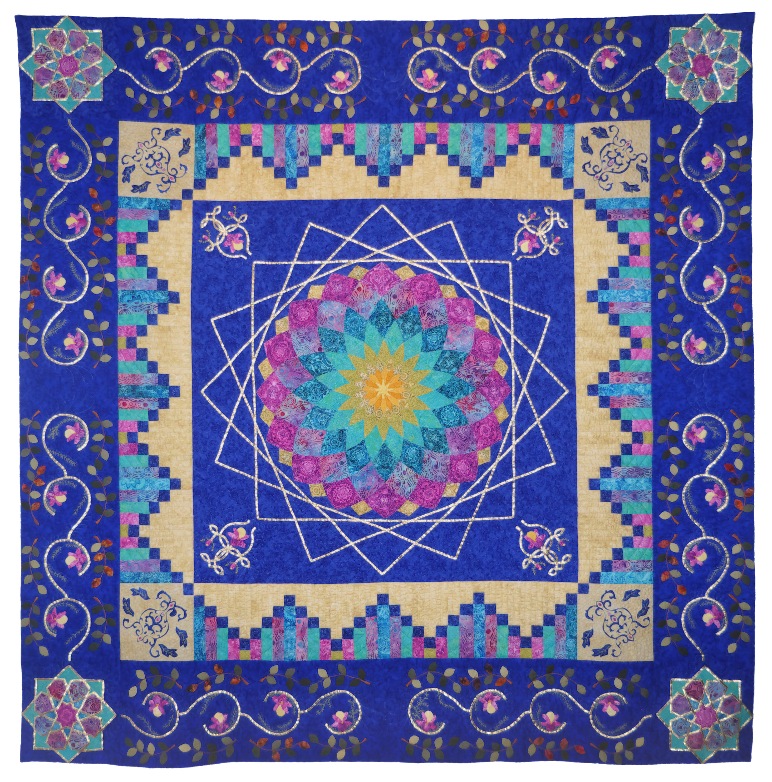
Could perhaps leave us indifferent a patchwork intitolato “Prague”? Ovviamente no.
It is a faithful reproduction of an antique quilt exhibited at the Museum of Decorative Arts in Prague, in the sector dedicated to the works of Central Europe built between 1820 e il 1850.
I will be told: ma come, you must have gone to Prague a thousand times for the PPM and you have not seen it? Avete ragione, it is unforgivable, but know that I tried, in the sense that they were carrying out maintenance work in the museum that year, and that wing was closed. Then the following year the Chinese plague arrived and I was never able to go back up.
I solemnly promise that I will fill this gap.
France Aubert – Prague
Even if on certain occasions the traditional blocks are geometrically simple, we must not forget the difficulties encountered by assembling a large number of tiles, working with painstaking care to avoid losing the flatness and dimensional accuracy of these great works. But I would like to add another obstacle than these quilter they have to overcome, or the finding of fabrics that are materially and chromatically similar to the ancient ones.
It is not the first time that Annick Tauzin exhibits a quilt “legendary”, like this fairly large work that was also present in Houston for the event “Legendary quilts“, together with others patchwork tradizionali, among which also that of France Aubert above.
Annick Tauzin – pledged
You should already know that I'm not crazy about this type of patchwork, but I can only bow (metaphorically that is) in the face of the evident technical skill and precision that manifest themselves in these large compositions, not to mention the documentary aspect, that is, the desire to preserve for future generations the motifs that made the history of this textile art.
One more small incident if you please: it goes without saying that these works are completely done by hand, e scusate se è poco.
There are gardens and gardens, as impressive as the gardens of the Palace of Versailles, overflowing with flowers like the Keukenhof in the Netherlands, the Zen gardens of Kyoto, gardens in literature, tragic-farcical like Chekhov's Cherry Orchards, or perhaps funnier like those of Kensigton, where the amazing adventures of Peter Pan take place.
However, it has nothing to do with the Islamic garden, il quale, in addition to the aesthetic aspect, has significant cultural and religious implications. For Muslims, the garden is above all the concentration of the elements of Creation; all of Creation is a garden. Di più, heaven itself, Yannat al Firdaws, it is a garden with its seven levels.
During our visit to the Alhambra I could see how bare and austere it looks from the outside, when inside there are beautiful gardens irrigated by a clever web of small canals, and while European gardens are the sumptuous setting for villas and castles, here the garden is always surrounded by walls, because it symbolizes heaven, from the ancient Persian word “Pairideaza“, dove On it significa “environment”, e now sta per “walls”.
Estrella Sanchez-Anna Gonzalez – islamic garden
It could be argued that the color of a garden is predominantly green, but this is an Islamic garden, where the most important element is water, on which the sky is reflected.
Estrella Sanchez lives in Cambrils, but she is originally from Granada, therefore she created a work that reminds her of the Moorish gardens of the Alhambra, with a work that could be defined “textile symbolism”. As she explains, the central square represents the Earth, and inside there is a dahlia whose shape recalls the circular dome of a mosque, whose summit is the yearning of the faithful towards divine unity (monotheism); the gold details represent the women, the only ones who can wear it; the small squares recall the colorful mosaic floors of the gardens, while the decorations along the edges are all that lives (and he dies) in those artificial oases. On blue and azure in Islamic culture I would like to report here the words of the Iranian painter Delara Darabi, hanged alone 23 years for a crime he did not commit (in Iran, exculpatory evidence does not count, judges can convict someone solely on the basis of their so-called intuition): l’blue is the color in which the gaze sinks without encountering obstacles, and lightens the shapes in a movement of opening and disintegration of matter, allowing the real to transform into the imaginary, che it is an escape from sensible reality.
Because we have to change the subject, I would like to use a nice patchwork by Alicia Lorenzo as a bridge to more compositions “light”, but no less beautiful, like this daisy that seems to explode and throw fragments of fabric away
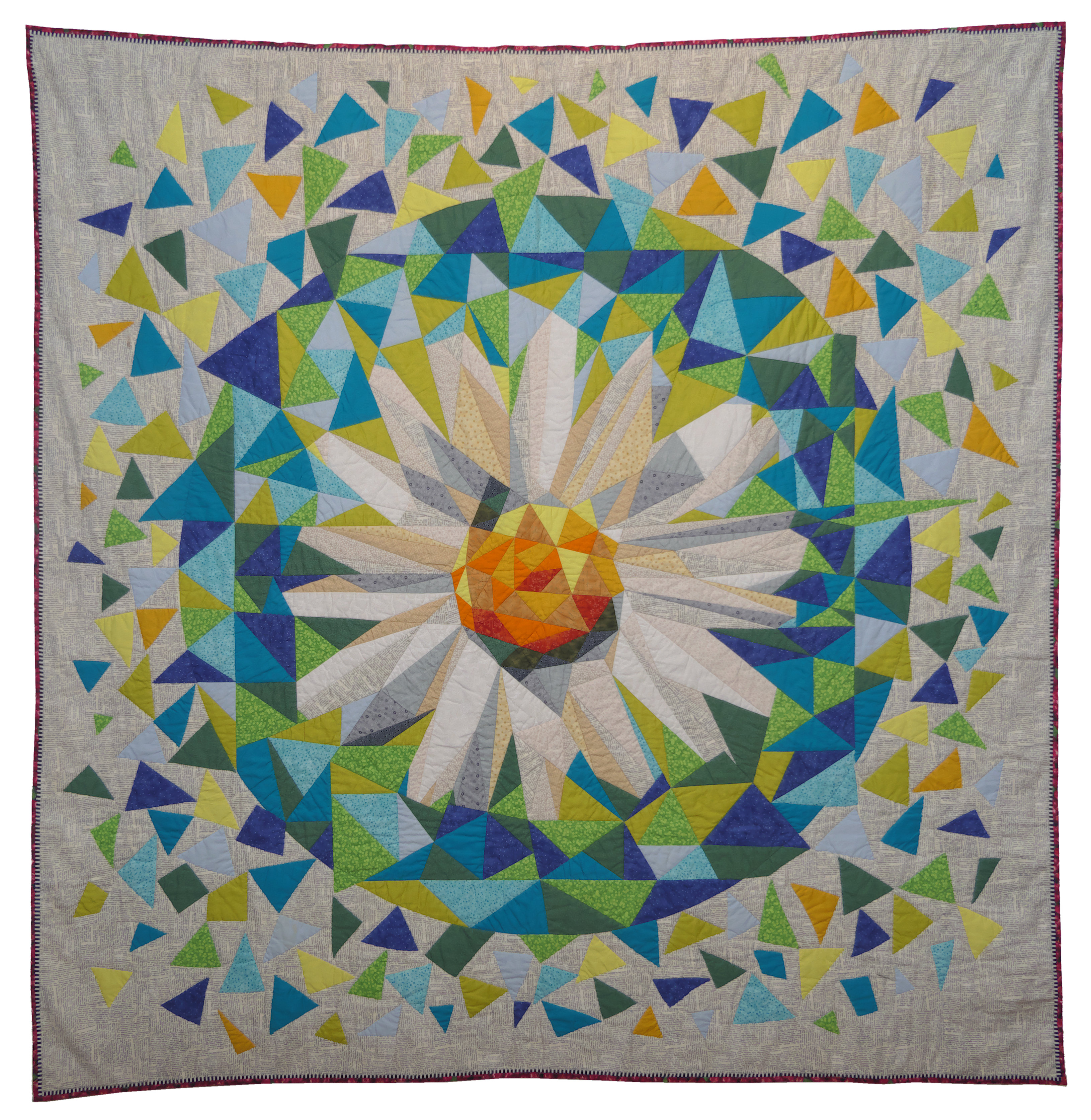
Alice Lawrence – Low Poly Daisy Quilt
I can't define the style. It seems a crazy, but it is not, not entirely at least. Structure and proportion are well respected, as well as the color balance. I'd say it's like a flower “natural”, stupendous in its random irregularities and its unpredictable harmony.
The edition 2023 of the Sitges Festival was dedicated to “Flora, wildlife and spring”, e le quilter have interpreted the theme in very different ways, which comforts me a lot.
There was who, eat hope white, he wanted to propose abstract images, something that looks like three small cornucopias that spread the life that is reborn after the winter.
hope white – Fauna, flora and spring
Esperanza Blanco is not new to these symbolic representations, and his figures are light and delicate, as well as the colors he chooses, even when they should be seasonally “turned on”.
On the contrary, Inmaculada Gabaldón preferred a representation that could bring her closer to the Pre-Raphaelite painters, magari un po’ more conspicuous, but still explicit in its graphic message.
Inmaculada Gabaldón – Fauna, Primavera, Flora
Of one thing I am certain, she is not afraid to impress, neither with themes nor with colors, I had a taste of it last year in Alsace, at the European Patchwork Crossroads.
Or you could choose to represent something minimal, hidden, yet essential, like the work below.
I remember Maria Ragusini noticing an interesting thing years ago in Verona quilt made together with M. Goretta Petta titled “East East East”, and if you want to see it, it is present in this article qui.
I found her again in Catalonia with a work that immediately struck me for the idea of superimposed layers, in addition to the beauty of the theme represented.
Maria Ragusini – Tenderness
Maria Ragusini – Tenderness – Detail
Difficult to capture with the camera the play of nuances and shadows that were created, in addition to the harmony of colors that had to respect naturalness and naturalness (they are not synonyms) of the scene. There is little to do, had to be there.
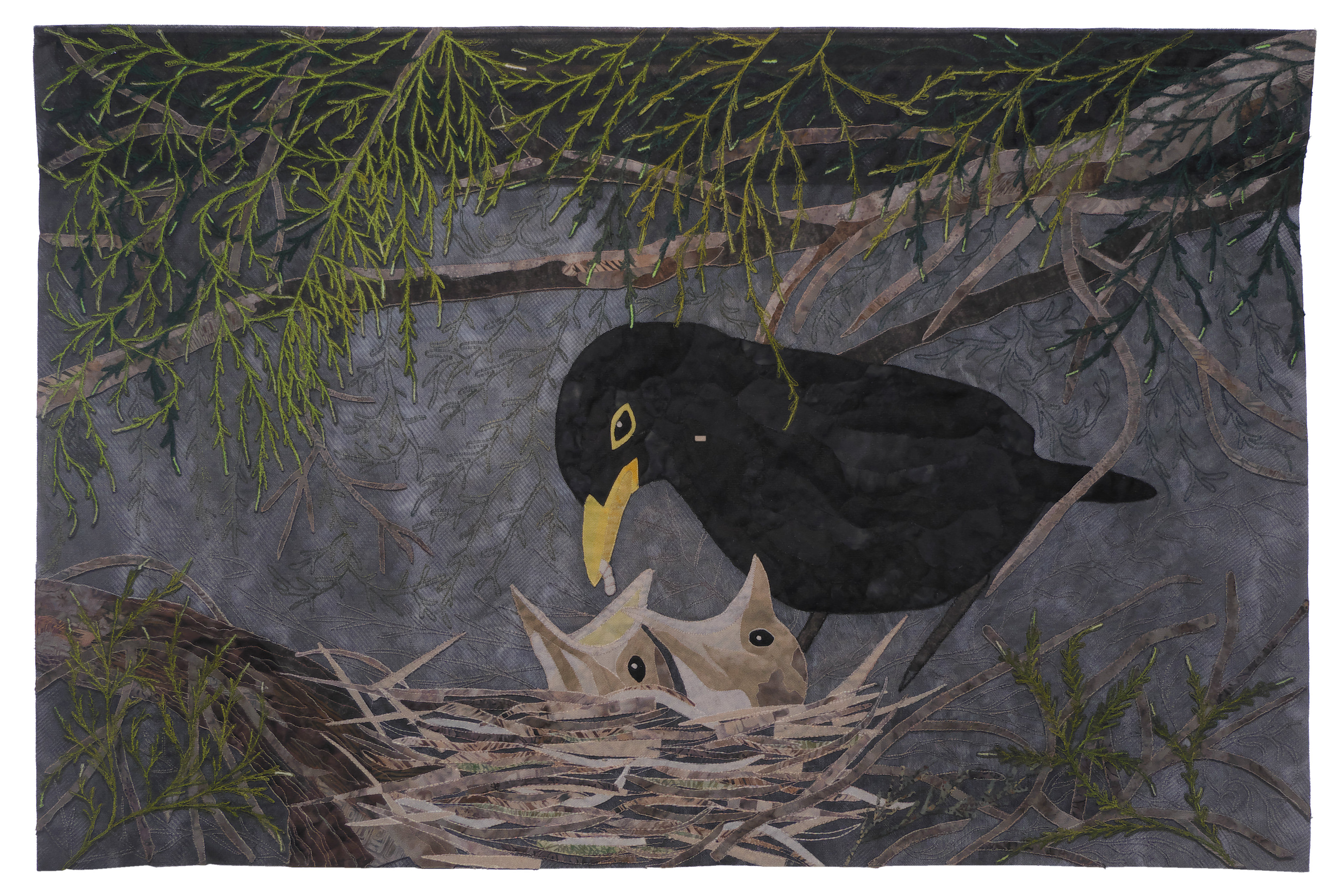
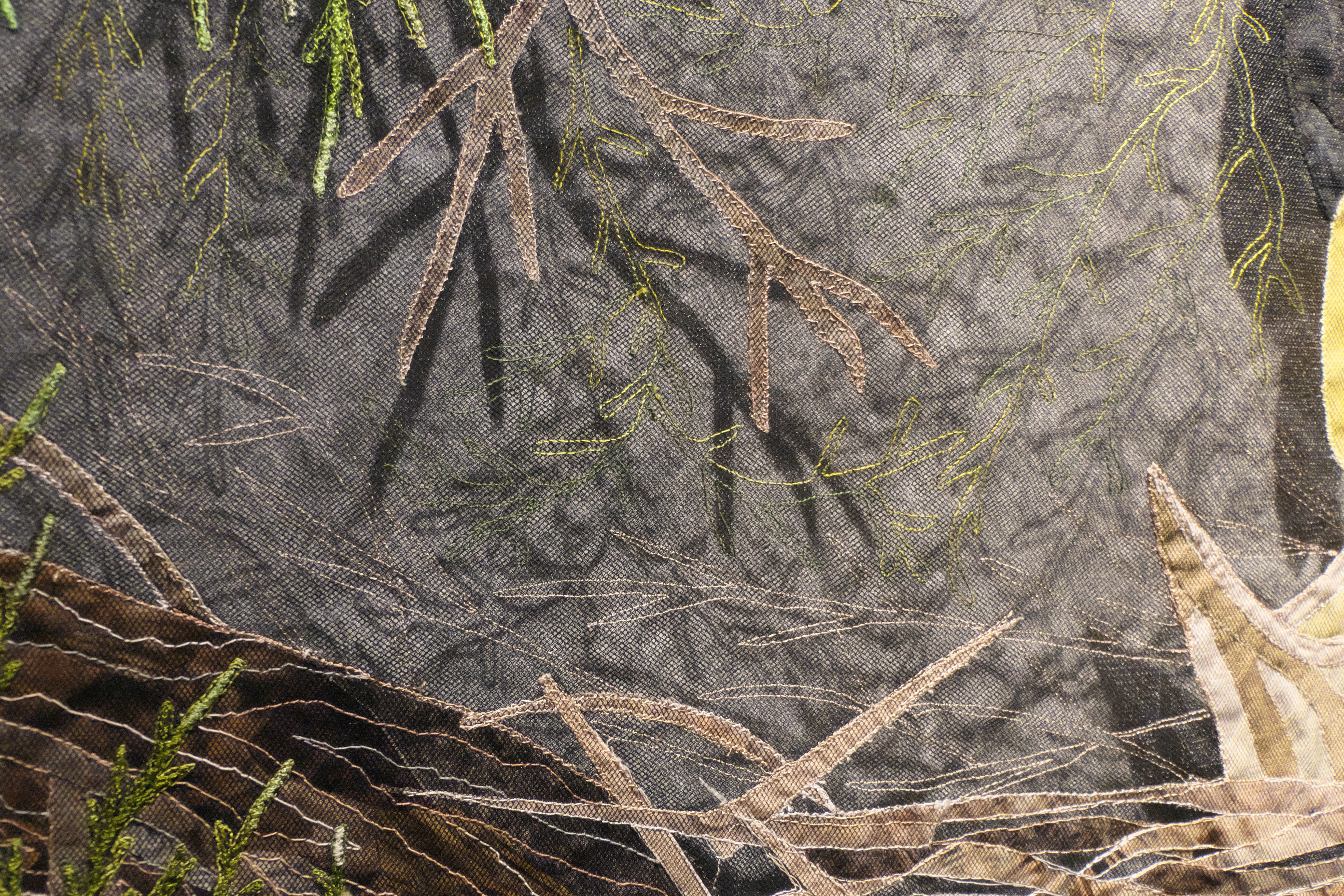
And if we talk about flora and fauna, other than spring, the mind travels to the Amazon rainforests, or to tropical paradises, to Polynesia, and to all those areas of the planet where nature has not yet been completely “enslaved” e, per certi versi, those places are often referred to as gods “havens”.
Eppure, per esempio, no need to cross oceans to New Guinea to find birds of paradise. Know that we could find its splendid colors in a common parrot, who compared to his noble cousins is less demanding and more empathetic. He deserves respect and attention because he is not an animal “domestic”, but it is a bird that yes “suitable” to live in our confined spaces.
If you don't mind talkers, a pair of grays are perfect, but if instead you have less space and are afraid of disturbing the neighbors, then the budgerigars will fill your house with color and joy, and you will have a little piece of heaven at home.
Galla Grotto – The parrot is a bird of paradise
Galla Grotto – The parrot is a bird of paradise – Detail
Chissà, perhaps those two parrots are from Galla Grotto. As it is, they look great in one quilt already beautiful of his (and for that matter I have yet to see one of his patchwork which I don't like…).
Of Montse Forcadell I still remember well a quilt intitolato “La gota” which I admired in Sitges in 2015 (visible qui), and then another glass encountered in Val d'Argent four years later (visible qui).
A personal exhibition was dedicated to her in Sitges, and there I was able to see how versatile she is, both in the choice of themes and in the use of the compositional technique. The work below is an example of this.
Anche lei, like her compatriot Esther Tronchoni Simo, he wanted to transpose something of the city where he lives onto fabric, Cambrils, and to be precise it is a monument taller than 6 meters erected in 2011 for the 100th anniversary of a dramatic event. On the night of 31 January, in the sea between Barcelona and Valencia, broke out unexpectedly “the perfect storm”, and they drowned well 140 people among sailors and fishermen, and of these last about fifteen were from Cambrils.
In reality, here we only see a good part of the sculpture, namely the sirens Dolça and Calma, while the group is also composed of three fishermen with their baskets and a child, Adrian, watching the sirens, symbol of hope in the future and trust in the prodigality of the sea.
Montse Forcadell – The plan of Serenes
Interesting that lanyard that comes out of the quilt, I would like to take it to be taken there, on the Cambrils seafront, sitting at an outdoor table in a tavern, with a glass of Mar de Priorat red wine in front of, half full of course.
Incidentally, questo quilt was awarded at the EQA2019 exhibition, when the theme was “borderless wires”, and that string that comes out of the edge of the picture is perfect.
From salt water to fresh water, that is, we go to the delta of the Ebro river, in which there is a large natural park of ben 300 square kilometers and more. Here the artist has found a corner of the world where everything is still, the jetty, to the boat, l’acqua, and maybe even the weather.
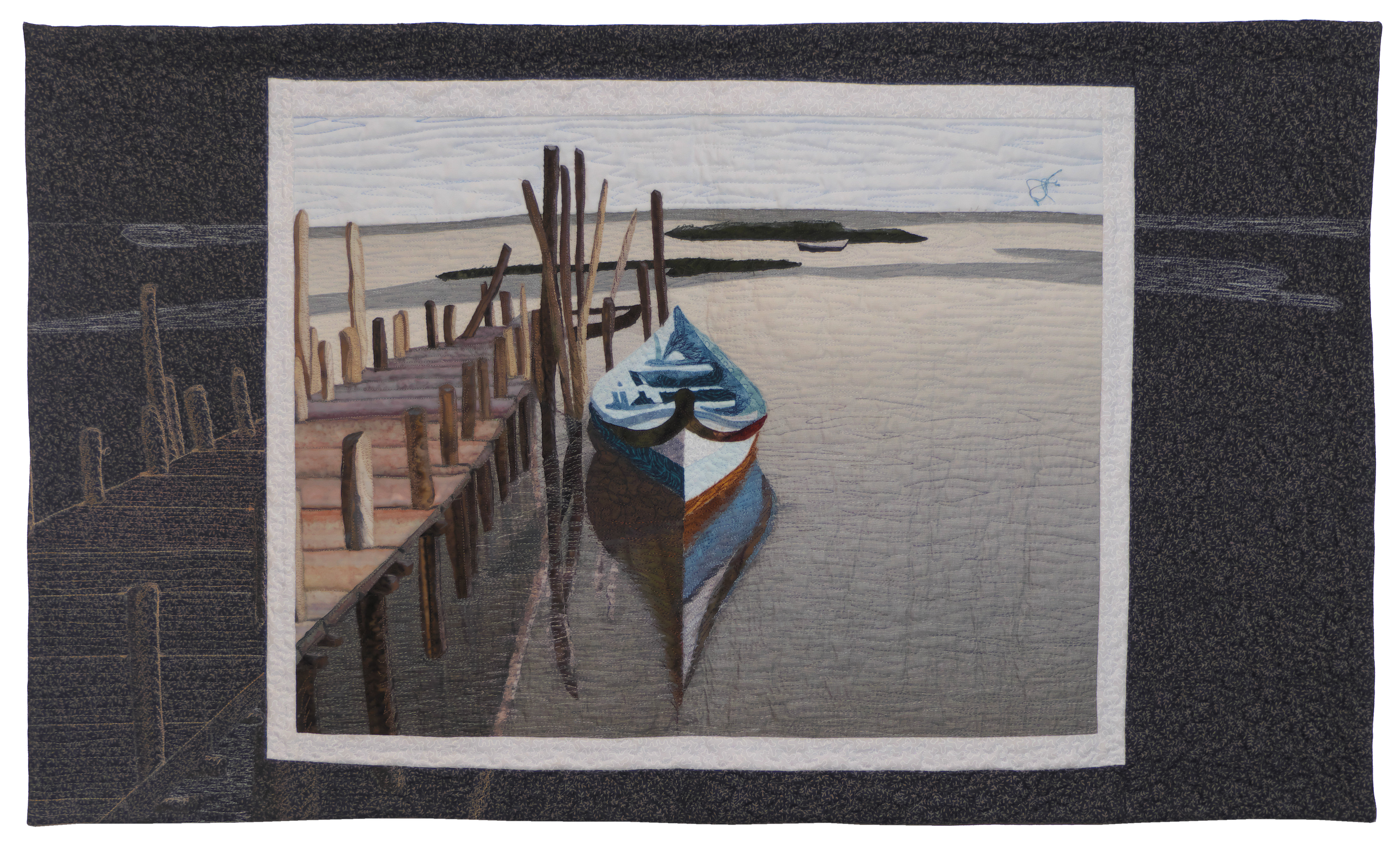
Montse Forcadell – A mirror in the sky
I was struck by the idea of framing the clear image, solar, with a dark area, lunare, as if the mirror “nel” sky mentioned in the title was instead a mirror “dal” cielo. The light that falls from above illuminates, create reflections, form shadows, generate colors, makes an otherwise dark reality visible, like a mirror, better than a mirror, but it could be the reality of a mirror, that of memory or an illusion.
The title is inspired by the song “Mediterranean”, by the Catalan singer-songwriter Santi Vendrell.
Everything is there , everything is born in his heart
|
Everything is there, everything is born in his heart
|
There would still be others quilt to show, and other things to say, ma, uno, I would risk boring you, due, I would finish in the summer.
I must also add that we have just returned from Moravia, and therefore we have to start preparing the PPM2023 post, which means developing all the photographs, rename them, select them, cut them out, put them on the net and finally find the right words to describe what you saw.
As always there is my Flickr page lastoffagiusta2022 at your disposal for all those images that I have not inserted here.
For images from previous years you can go to the Flickr pages lastoffagiusta2019 e lastoffagiusta2013.
Comunque, if you haven't had enough yet, below is available (anche in HD) a short video that we edited for the occasion.
Che altro dire, we had a lot of luck, ate well and drank better, met people who to define friendly would be an understatement, felt amazement and emotion in front of ancient traditions, like flamenco or the Easter, listened to the story told by the Alhambra, experienced unforgettable moments in front of a blue surface that seems to have no limits, walked for miles on a seafront made of sheer rocks and crashing waves, e, for a while', made peace with life.
I remember my photographer / sherpa / travel agent / pusher / ecc. to Granada, in the building where we were staying, he found a sort of terrace overlooking the roofs of the Albaicín and the walls of the Alhambra. Precipitatosi in camera, he picked up a sheet of paper and a pen to immediately go back up and write down what he felt at that moment. A short poem came out which partially collects the emotions impossible to capture with a photograph: The Albaicin.
Ringraziamenti
-
My sherpa / guide / photographer / webmaster / etc. ancora una volta, sperabilmente non l final.
-
Claudia from the Noucentista Hotel in Sitges, for the attention he has dedicated to us.
-
Jupiter Pluvio, for standing us up for two whole weeks.
-
The old restaurant of Granada, for the sophistication of its cuisine.
-
Consuelo, for being an incomparable guide to the Alhambra.
-
Rumen Stoykov, of the Dabov café in Madrid, for its tasty preparations.
-
Alejandra, for waiting patiently for us on arrival in Madrid until eleven in the evening.
-
Frankie, for the musical notes at the end of the movie.
-
Our “old” Lumia with its app “Here”, to always find the way.
-
The G44 coffee, in Málaga, for a Malaga-flavored ice cream that we can't even dream of here.
-
The quilters who have kindly replied to my emails.
-
Wikipedia, for everything we didn't know.
-
The town of Sitges, for his xato.
-
Lady Luck, for being there.
Bye
Pingback: HELLO! (to) | My3Place